Utility Panels
Workspaces
The workspace is the area where you can view your data.
The workspace can be subdivided into display panels and the size of the display panels can be adjusted by dragging on their edges.
To import external files, drag them into display panels.
To show items in display panels, drag them from the data panel.
To select display panels for processing, click one panel or Shift + click to select multiple.
If you do processing or acquisition which produces new data, its associated display item will be displayed in an empty display panel if available.
See Display Panels.
Using Utility Panels
Utility panels provide options for the selected item or items. There are various utility panels for editing different aspects of data.
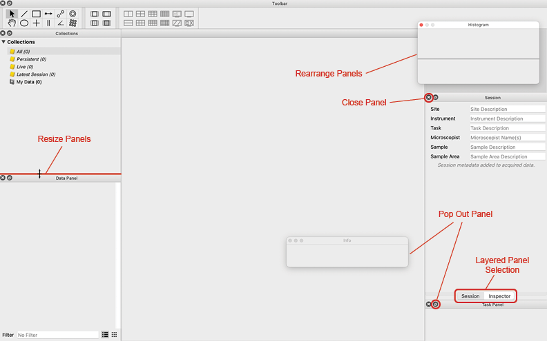
The layout of the utility panels can also be moved around and adjusted. There are several ways to customize the utility panel layout:
Show or hide any utility panel using .
Close a utility panel by clicking the x button in the corner of its title bar.
Rearrange the layout of the shown panels by clicking and dragging a utility panel by its title bar.
Stack utility panels by dropping one utility panel onto another. If two or more panels are in a stack, selection buttons will appear at the bottom of the panel to switch between them.
Expand utility panels into a separate window by dragging the panel by the title bar away from the main window.
Resize a utility panel by clicking and dragging from its edges.
The utility panels are organized alphabetically in and their functions are as follows:
Activity
The Activity panel () shows the activity of computations running in the background.
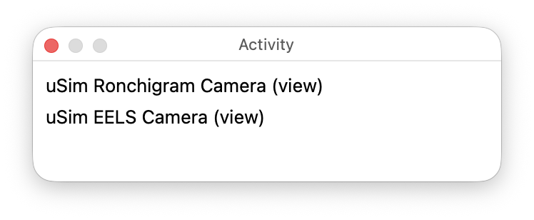
The activity panel displays changes to computations and updates during live data acquisition or editing. When no computation is actively running, the panel is empty.
Some computations are connected to a graphic. When such a graphic is being moved or manipulated, the activity panel displays activity information for the associated computation.
Collections
The Collections panel () sorts the data items in a project into folders. Data can also be sorted manually into a custom folder.
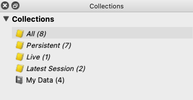
Data items are automatically sorted into four standard collections. See Standard Collections below for the definitions.
To view a collection, click on the title of the desired collection in the Collections panel. All data items in the collection will be listed in the Data panel. By default, the Data panel is set to show the “All” collection.
The Collections panel also provides a collection called My Data which is curated by the user. “My Data” can be used to group any data items together. To add a data item to the “My Data” collection, drag the data item from the data panel into the “My Data” collection in the Collections panel.
To add a new collection to the panel, choose . Use this new folder just as the My Data folder above.
Standard Collections
There are four standard collections that are always available in the Collections panel:
All: This collection shows all items in the data panel.
Live: This collection shows all items that are currently being acquired including downstream computed items.
Persistent: This collection shows all items that are not currently being acquired.
Latest Session: This collection shows all items that were created in the most recent session.
Data Groups
You can create custom Data Groups to organize items.
To create a new Data Group, choose .
To add items to a Data Group, drag them from either the data panel or a display panel into the Data Group in the Collections panel.
To remove items from a Data Group, click the Data Group in the Collections panel, select items in the data panel, and press Delete. This removes only the association with the Data Group, not the items themselves.
To rename a Data Group, click it and press Return, or double-click the item.
To delete a Data Group, select it and press Delete. This deletes the group, not the items in it.
Data Panel
The Data panel () provides a list of the data items in a given collection.
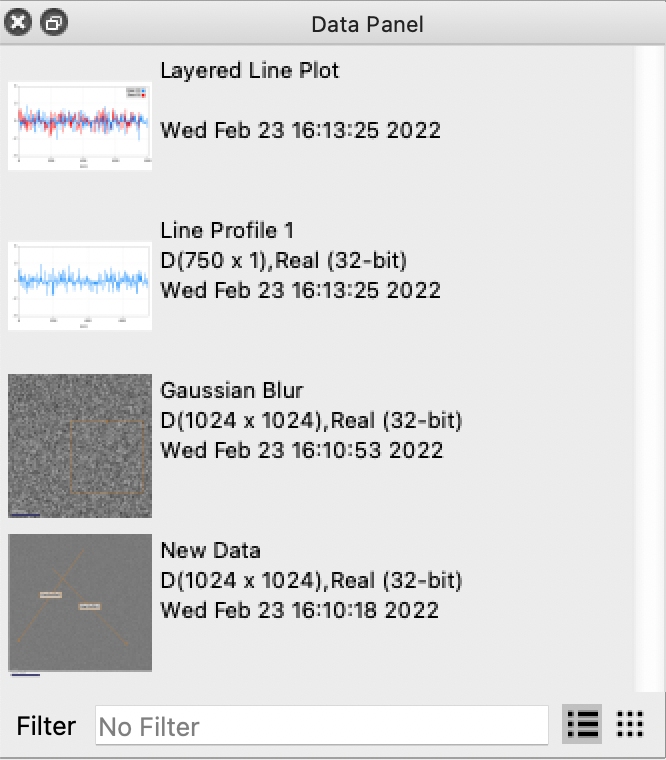
Any data item in the data panel can be displayed in a display panel. To display a data item, drag the data item from the data panel into an empty display panel.
By default, the Data panel is set to show all data items in a project, but the data panel can show any other collection by choosing a different collection in the Collections panel.
To search for data items in the selected collection, use the filter text box at the bottom of the Data panel. If a data item is not in the selected collection, it will not appear in filtered results. The filter matches keywords in item titles and captions.
Newly created data items will appear in the data panel. Make sure the collection is set to “All.” A new data item may not be applicable to the currently selected collection.
To delete a data item, select it in the data panel and press Delete.
To select multiple data items, hold Control (or Command on macOS) while selecting items.
Histogram
The Histogram panel () shows the frequency of different intensities in the selected data item.
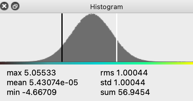
The histogram displays several visual elements and information:
The color range bar directly under the histogram displays the color range and changes to match the color map of the selected display.
General values about the data (maximum value, mean, minimum value, etc.) are displayed under the histogram.
When no display panel is selected, more than one display panel is selected, or the selected display item contains more than one data item, the panel is empty.
Selecting and adjusting ranges:
To select a range of data, click and drag between two points on the histogram.
The histogram zooms into the selected range, and the associated display panel shows only data values within that range.
To reset the range, double-click on the histogram.
Graphic-specific behavior:
If a crop graphic is selected, the histogram shows data within that graphic only.
Click on a display panel outside the graphic to show the histogram for the full range of the data item.
Info
The Info panel () shows the position of the cursor and the value at the pixel under the cursor when the cursor is over a display panel showing a single data item. It also shows the intensity level of the data represented at the cursor position in the histogram panel.
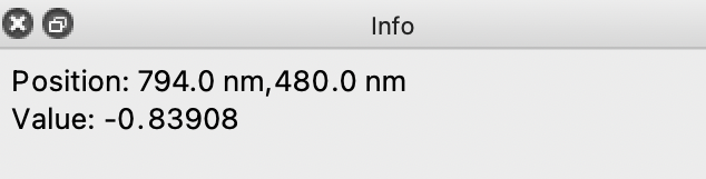
When hovering the cursor over the histogram, the info panel shows the intensity for a given position along the histogram.
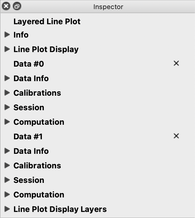
Inspector
The Inspector panel () shows information and settings for the selected item. The Inspector is split into subsections for specific functions. Clicking the triangle next to the title of a given subsection will expand or hide the subsection.
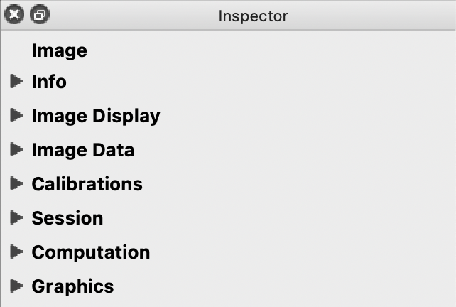
When different kinds of items are selected (display item, graphic, etc.) the Inspector’s subsections will change to display settings relevant to the selected type of item. In the image above, an image is selected; and in the image below, a line plot is selected.
Info
The Info subsection of the inspector allows you to edit the title and description of the selected item.
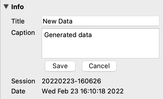
The Info subsection will only be visible if a single item is selected. If the item selected contains multiple data items, like a layered line plot for example, changing the title and description of the item will not affect the names and descriptions of each data item; it will change the title and description for the combined display item. To edit individual data item titles, you must use a display that shows only that data item.
To edit the description / caption, press the Edit button, make your changes, then click Save or Cancel.
Image Display
The Image Display inspector subsection allows you to force the display to either a line plot or an image instead of the default (which is an image for 2D data and a line plot for 1D data).
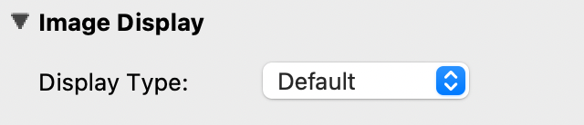
To revert an image to the default display, choose Default.
Image Data
Image Data presents several controls and settings for a selected image:
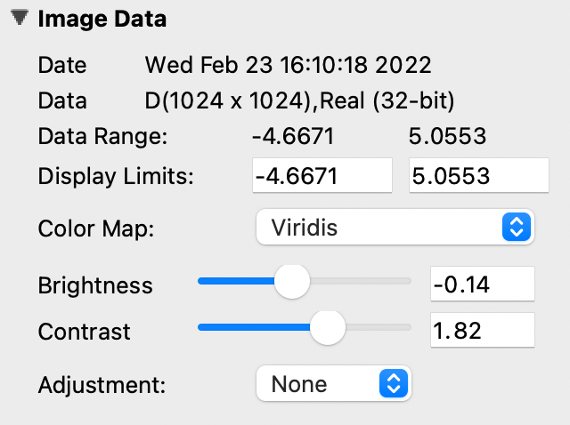
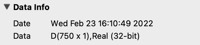
Date - Displays the date and time the image was created.
Data - Displays the dimensions of the image and the bit count.
Data Range - Displays the minimum and maximum values of the selected data.
Display Limits - Change the minimum and maximum values currently shown in the selected data. Editing these is equivalent to zooming on an interval in the Histogram.
Color Map - Change the color of the data. The data range is mapped to a range of colors. Choose from a list of preset color profiles. Grayscale is the default.
Brightness - Change the brightness of the color values on the color map. The slider ranges from -1.0 to 1.0 (default is 0.0).
Moving the brightness slider to the right increases brightness; moving left decreases it.
Contrast - Change the range of color values on the color map. The slider ranges from 1/10 to 10 (default is 1.0). You can enter values as fractions, such as “1/2”.
Moving the contrast slider to the right increases contrast; moving left decreases it.
Adjustment - Change the equalization of the selected data. Choose between Equalized, Gamma, Log, or no adjustment.
Equalized attempts to maximize color variation where intensity density is highest.
Log applies a logarithmic transfer function. If intensity values are small or negative, Log behavior is undefined.
Gamma - If Gamma is selected for the adjustment, a slider will appear to adjust gamma values. The slider ranges from 10 to 1/10 (default is 1.0). You can enter values as fractions, such as “1/2”.
Moving the gamma slider to the right decreases the gamma value; moving left increases it.
Complex Display - If the data is complex, choose how to convert it to a scalar value for display. The options are Log Absolute, Absolute, Phase, Real, and Imaginary. The default is Log Absolute.
Line Plot Display
Line Plot Display presents several controls and settings for a selected line plot:
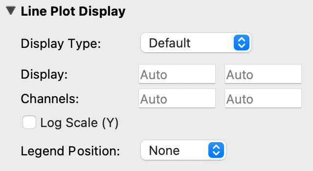
Display Type - Force the selected line plot to display as an image instead of a line plot, or vice versa.
Display - Change the range of y values (intensity) shown on the line plot.
The display range is set to automatically calculate by default, but you can edit it to zoom into a specific section.
Reset either display limit to auto by deleting the value and pressing Enter.
Channels - Change the range of x values shown on the line plot.
The channel range is set to automatically calculate by default, but you can edit it to zoom into a specific section (similar to zooming with an interval graphic).
Reset either channel limit to auto by deleting the value and pressing Enter.
Log Scale Y - Set the y axis to scale logarithmically.
Legend Position - Choose the position of the legend for a layered line plot: None, Top Left, Top Right, Outer Left, or Outer Right. Line plots with no layers will not show a legend.
Complex Display - If the data is complex, choose how to convert it to a scalar value for display. The options are Log Absolute, Absolute, Phase, Real, and Imaginary. The default is Log Absolute.
Data Info
Data Info displays the date and time a selected line plot was created. It will also display the dimensions of the line plot and the bit count.
For line plots with multiple layers, each data item in the stack will have its own Data Info section. For more information, see Line Plot Display Layers.
Calibrations
Calibrations allow you to make specific changes to the scale and position of a selected item. Images and line plot displays have different features in the calibrations subsection.
Image Calibrations
When an image is selected, the calibrations subsection of the inspector panel will show variables specific to an image.
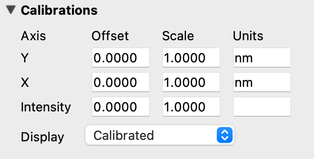
With an image selected, use the calibrations subsection to
Change the offset, scale, and units on the y and x axes. The default units for images is nanometers (nm).
Apply the calibration formula
x' = x * scale + offset. You can enter scale and offset values as fractions, such as “1/2”.Change the intensity offset, scale, and units of the selected image.
Change the coordinate system using the Display combo box. This also affects how the cursor position is shown in the Info panel. See Data and Displays for more information.
Line Plot Calibrations
When a line plot is selected, the calibrations subsection of the inspector panel will show variables specific to a line plot.
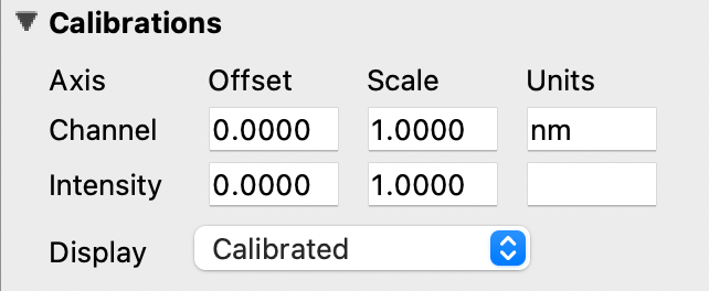
With a line plot selected, use the calibrations subsection to
Change the offset, scale, and units of the x axis (Channel). You can enter values as fractions, such as “1/2”.
Change the coordinate system using the Display combo box.
The coordinate system selection affects how the cursor position is shown in the Info panel. See Data and Displays for more information on coordinate systems.
Session
The Session subsection of the inspector allows you to change the session info for the selected item.
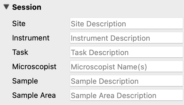
Editing session info in the inspector will not change global session info. Global session info is added to a data item when it is acquired or imported. To edit the global session information that gets applied to all new data, see Sessions Panel.
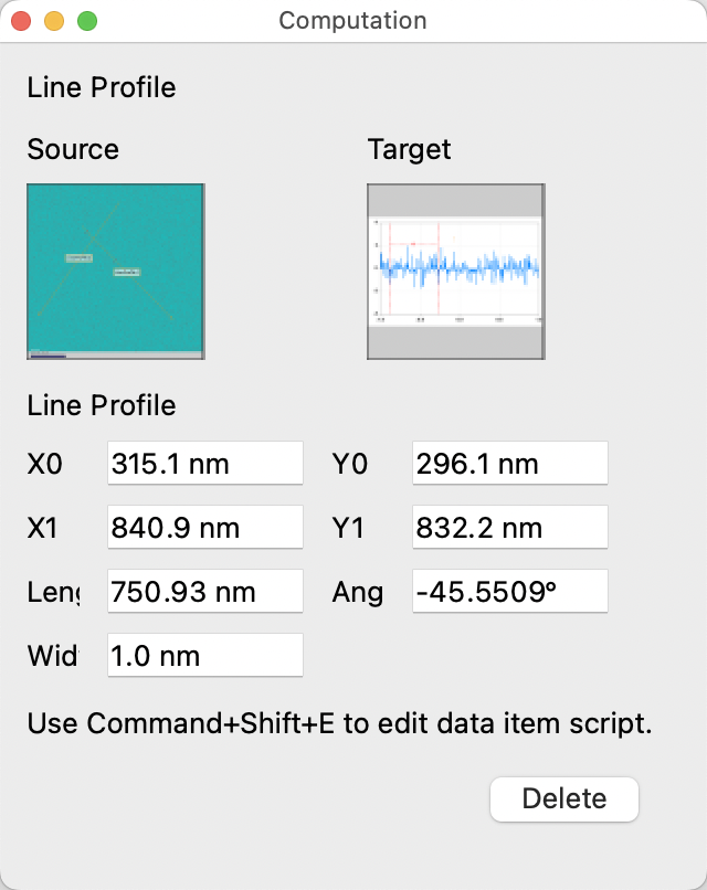
Computation
The Computation subsection of the Inspector can be used to adjust variables for a computation associated with the selected item.
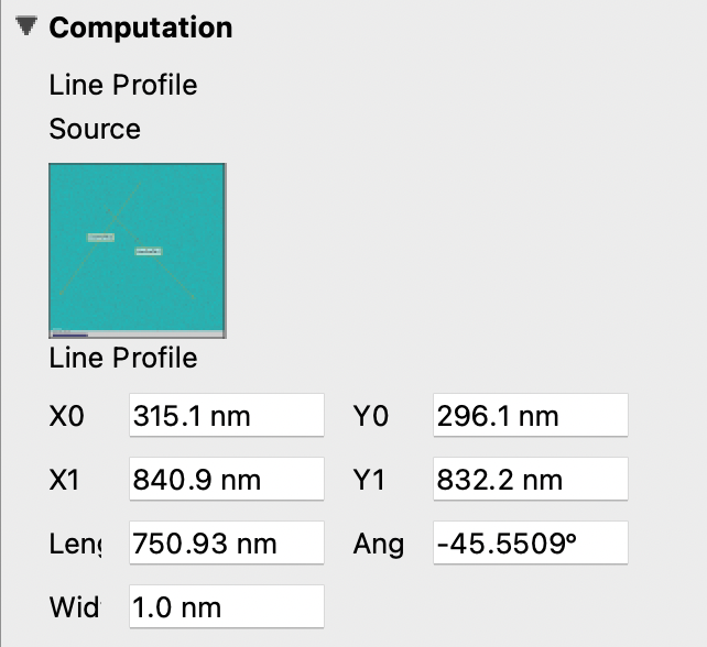
The variables displayed in this subsection depend on the selected item type:
A line profile will show adjustments for the coordinates of each end, the angle, and the length and width.
A processing filter (such as Gaussian blur) may show only a single slider to adjust the sigma (blur) value.
If the selected item has no associated computations, the subsection will display “None.”
To open the computation editor window (with a larger editing interface), press Ctrl+E (or Command+E on macOS). This provides the same functionality as the subsection with more screen space.
Sequence
The Sequence subsection appears when the selected data is a sequence (a series of frames recorded over time or acquired consecutively). It provides an index slider and text field to select which frame in the sequence to display.
Index
The Index subsection appears when the selected data is a collection (multi-dimensional data with one or more collection dimensions, such as a spectrum image). It provides one index slider per collection dimension to navigate through the data.
Slice
The Slice subsection appears when the selected data has a spectral or depth dimension that can be projected onto a 2D image. It provides a Slice index control to choose which position along the depth axis to display, and a Width control to average over a range of positions around the selected index.
Line Plot Display Layers
With this subsection, you can manage all aspects of the layers in a layered line plot.
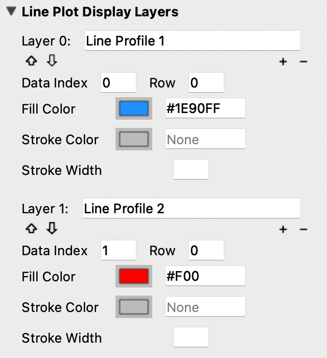
With the layered line plot selected, you can
Change the order of layers using the up and down arrow buttons under the layer number.
Add or remove layers with the plus and minus buttons to the right of the arrow buttons.
Associate layers with data items in the stack using the text box labeled Data Index. Type the data item number as it appears in the stack.
Choose which row of a data item to show. If a data item has multiple rows, use the “Row” text box to select the desired row. Row numbering starts at 0.
Change the fill color and stroke color using the color or text boxes under each layer’s section.
Change colors with text like rgb(100, 50, 200), #55AAFF, or a web-defined color like “Blue”
Choose colors with the color selection panel by clicking on the color box next to “Fill Color” or “Stroke Color.”
Input transparent colors with text like rgb(100, 50, 200, .5) or #55AAFF80.
Change the transparency of a color using the opacity sliders at the bottom of the color selection panel.
Choose no color by deleting any text from the text box next to “Fill Color” or “Stroke Color.” The text box will show a gray “None.”
Change the stroke width by typing a number into the “Stroke Width” text box. This creates an outline of the stroke color around the associated layer.
Change the complex display type for a layer. If the data is complex, choose Log Absolute, Absolute, Phase, Real, or Imaginary to control how the data is converted to a scalar for display.
Graphics
The Graphics subsection shows options for selected graphics, or for graphics associated with the selected data item. If multiple graphics are selected, the inspector will list options for all selected graphics.
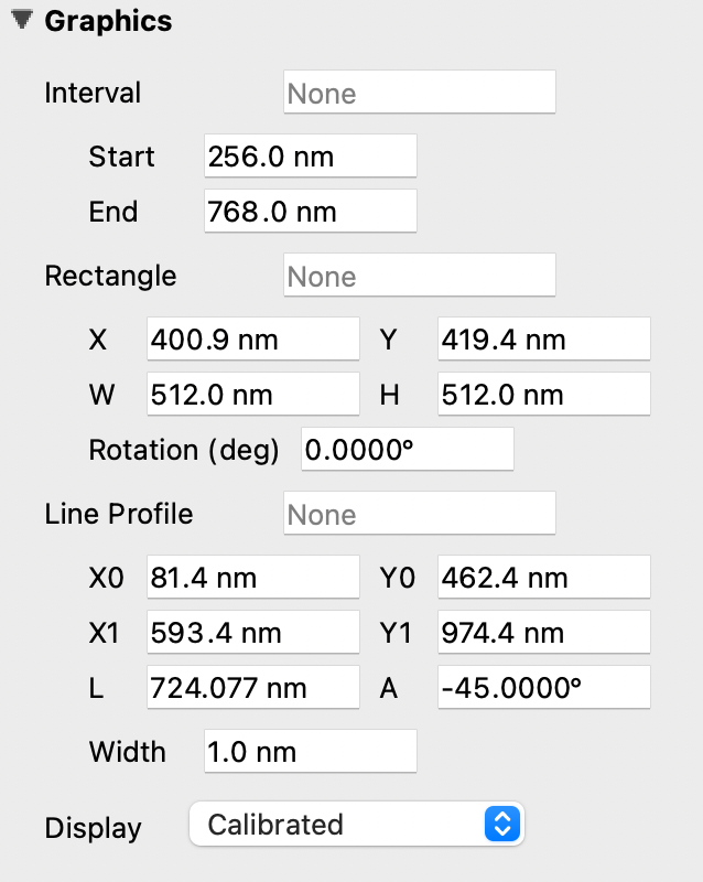
Each graphic has a different set of editable variables in this subsection.
Most variables can be edited by typing values in the Inspector or by dragging control points in the display panel.
Variable inputs and outputs use the coordinate system selected in the calibrations display drop-down. See Data and Displays (Calibrations) for coordinate system details.
Each graphic will have some or all of the following variables:
Label - The label of the selected graphic. To show no label on a graphic, remove all text from the label text box. The box will show a gray “None.”
X, Y - The center coordinate of a graphic in nanometers (nm), pixels, or a decimal fraction depending on the coordinate system selected.
X0, Y0, and/or X1, Y1 - The coordinates of anchor points or vertices of a graphic in nanometers (nm), pixels, or a decimal fraction depending on the coordinate system selected.
W, H - The width and height of a graphic in nanometers (nm), pixels, or a decimal fraction depending on the coordinate system selected.
L - The length of a graphic in nanometers (nm), pixels, or a decimal fraction depending on the coordinate system selected.
A - The angle of a graphic in degrees. Angle inputs over 180 degrees will be automatically reformatted into the equivalent negative angle. For example, an input of 225 degrees in the text box will be reformatted as -135 degrees.
Rotation - The rotation of a graphic in degrees around its center point.
Start/End - The end points of a graphic on a line plot in nanometers (nm), pixels, or a decimal fraction depending on the coordinate system selected.
Radius 1 - The outer radius of a Band-Pass Graphic in nanometers (nm), pixels, or a decimal fraction depending on the coordinate system selected.
Radius 2 - The inner radius of a Band-Pass Graphic in nanometers (nm), pixels, or a decimal fraction depending on the coordinate system selected.
Mode - The filter mode of a Band-Pass Graphic. See Graphics for details.
Start Angle - The starting angle of an Angular Graphic in degrees.
End Angle - The ending angle of an Angular Graphic in degrees.
Display - The type of coordinate system used to label the coordinates on the image or line plot. See Data and Displays for information on different types of coordinate systems.
Each graphic also provides lock controls to prevent accidental changes:
Position lock - Prevents the graphic from being repositioned.
Shape lock - Prevents the graphic from being resized or reshaped.
Rotation lock - Prevents the graphic from being rotated.
Each graphic provides fill and stroke styling controls:
Fill Color - Sets the fill color of the graphic. Enter a color as text (e.g.,
rgb(100, 50, 200),#55AAFF, or a web color name likeblue), or click the color swatch to use the color picker. Delete the text to use no fill (transparent).Stroke Color - Sets the stroke (outline) color of the graphic. Same input options as Fill Color.
Stroke Width - Sets the width of the stroke (outline) in pixels.
The available coordinate variables differ by graphic type:
Line Profile - Start and end points (X0, Y0, X1, Y1), length (L), angle (A) in degrees, and width of the integration region.
Line - Start and end points (X0, Y0, X1, Y1), length (L), and angle (A) in degrees.
Rectangle / Ellipse - Center position (X, Y), size (W, H), and rotation (Rotation) in degrees.
Point - Position (X, Y).
Interval - Start and end channels (Start/End).
Position - Channel position on a line plot.
Spot Graphic - Center position, size, and rotation (in degrees) of the primary spot.
Angular Graphic - Start angle and end angle (both in degrees).
Band-Pass Graphic - Inner radius (Radius 2), outer radius (Radius 1), and filter mode (low, high, band) via Mode.
Lattice Graphic - Center position, size, and rotation (in degrees) of the primary and secondary lattice spots.
Metadata
The Metadata panel () shows the metadata attached to the data item associated with the selected display item as a tree view. If no metadata is present, the panel will show “No metadata available.” The session info will be added as metadata to any live data acquired during a given session.
Output
The Output panel () displays output text at the bottom of the window while running Nion Swift. This is useful for debugging the application.
Additional debugging information may be available using debugger consoles if the application is launched from a terminal.
Session
The Session panel () lets you edit the default session info that will be applied to new data items.
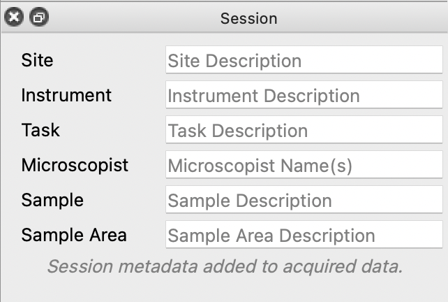
The session info will be added as metadata to any live data acquired during a given session. Every time Nion Swift is closed and reopened, a new session starts and global session info resets.
Task Panel
The Task panel () allows you to see the output from tasks such as microscope tuning. The output is often arranged into a table of data.
Tool Bar
The Tool Bar () allows you to select tools, adjust image zooming, and modify the workspace.
The tools available are the pointer, hand, line, rectangle, ellipse, point, line profile, interval, spot, angular, band-pass, and lattice tools. Some tools have keyboard shortcuts which can be seen by hovering over the tool.
The zoom buttons allow you to set raster image displays to fill the space with the image (Fill), fit the image to the space (Fit), set the pixel scaling to one data pixel per screen pixel (1:1), and set the pixel scaling to one data pixel per two screen pixels (2:1).
The workspace buttons allow you to split the workspace panels horizontally and vertically, or into grids of 2x2, 3x2, 3x3, 4x3, 4x4, 5x4. There is a button to expand the selected display panels. Pressing this button repeatedly allows you to select all of the display panels with a few clicks. There are also buttons to clear the contents of the selected display panels, close the selected display panels, and reset the workspace to a single display panel.
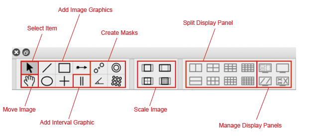
Some tools on the Tool Bar have keyboard shortcuts. For example, pressing E selects the pointer tool.
To view tool shortcuts, hover over a tool button.
Recorder
The Recorder dialog () allows you to record data at regular intervals from the display item selected when you open the recorder.
To record acquisition, follow these steps:
Click the live acquisition display panel.
Open the Recorder dialog.
Enter the desired interval (in milliseconds) and the number of items to record.
Click Record.
The resulting data item will be a sequence of data sampled from the live data at regular intervals.
Notifications
The Notification dialog () allows you to see notifications about errors and other important information that occurs while running the software.
The dialog will open automatically in the last location if a notification occurs. You must dismiss the notification and close the dialog.